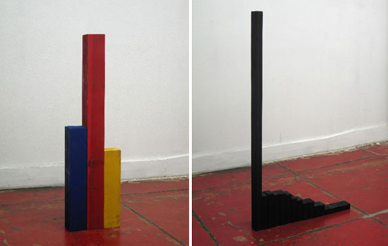
These wooden graphs by Joshua Callaghan show uh, something on the left and military spending on the right. While I wouldn’t call them any type of spectacular representation of data, I do like the idea of placing data into a physical space. We always get our graphs on a computer screen or on paper at best, which can take the human out of the data. It’s easy to forget that a single data point can represent an entire human life (or death). Keep that in mind the next time you analyze a dataset.
[via designboom | Thanks, Guðmundur]


I love the stuff DesignBoom puts out there. Thanks for the post. I really liked his Consumer Confidence piece.