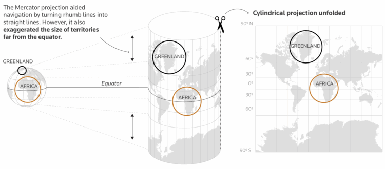
For Reuters, Mariano Zafra and Sudev Kiyada highlight the true size of Africa and use the opportunity to describe map projections with handy illustrations.
You would think by now, after many maps, illustrations, and interactive graphics, we would have a better intuition for the pros and cons of different map projections. But then the African Union wouldn’t still need to campaign for anything other than the Mercator projection.
For scale, Reuters also includes a bunch of countries crammed into Africa’s borders:
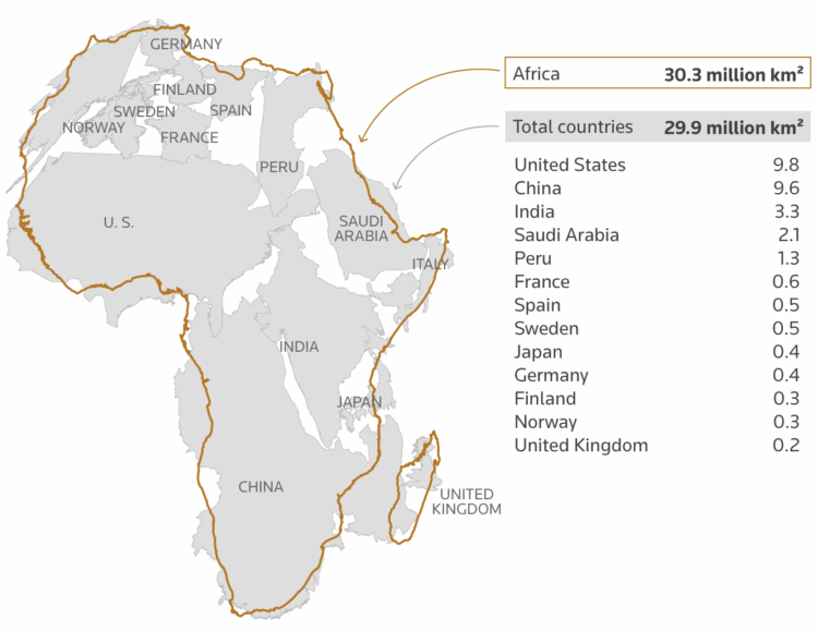
This is a nice riff on a 2010 map of the same theme.
 Visualize This: The FlowingData Guide to Design, Visualization, and Statistics (2nd Edition)