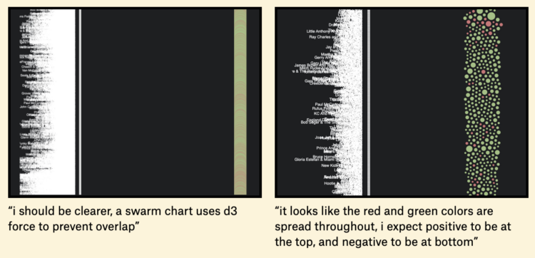
For The Pudding, Russell Samora and Michelle Pera-McGhee gave generative AI a serious try to see how much effort is required and the quality of the results. There was output. It wasn’t the best. However:
It’s sort of like comparing a woodworking artisan’s table to one from IKEA. The artisans invest immense time and effort into their high-quality pieces, while IKEA produces things quickly and cheaply, and most people probably can’t tell the difference (or don’t care). Which is kind of sad for us artisans. With AI, we can expect a rise in superficially appealing but low-quality content. But that doesn’t mean there’s no place for craftsmanship. We still find meaning in the bespoke, at doing all the little things right, and in creating things that feel like they have a real person at the other end of it. And we can only hope that others do too.
As they say, this the worst that generative AI will be. It’ll only get better and the chart-making will only get easier. But, analysis, narrative, and the finer details that fit perfectly with a dataset are a lot harder to replicate, because the process is more fluid.
Moving forward, the part of the process that makes data less cold and mechanical is where to focus our energy on.


 Visualize This: The FlowingData Guide to Design, Visualization, and Statistics (2nd Edition)
