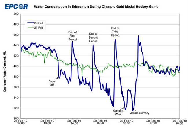
EPCOR, the water utility company that runs the fountains up in Edmonton, Canada released this graph yesterday. It’s water consumption during the Olympic gold medal hockey game, overlaying consumption of the previous day. How much do Canadians love their hockey? A lot.
The first period ends. Time to pee. The second period ends. Time to pee. The third period ends. Time to pee. Consumption goes way down when Canada wins and during the medal ceremony.
Finally, when it’s all said and done, the rest of the country can relieve itself, figuratively and literally.
[via contrarian | thanks, @statpumpkin]


 Visualize This: The FlowingData Guide to Design, Visualization, and Statistics (2nd Edition)

It looks to me like a net savings of water. That could be helpful in drought times here in Southern California!
By far my favorite post thus far. Keep ’em coming.
Reminds me of the animated movie “Flushed Away” (http://www.imdb.com/title/tt0424095/)
Pingback: Verities and Vagaries » Blog Archive » Morning Constitutional – Wednesday, 10 March 2010 -
nice post of flushing data by flowing data :)
Excellent graphic to include the prior day’s consumption and also highlighting the main stages on game day. It could also be annotated the larger consumption before the game starts, as everyone prepares to “hunker down.” Not included? The water loss attributable to the tears of joy or sadness, depended on which side of the border you rooted for. Mine were in sadness, but what a great game!!! U-S-A! U-S-A! U-S-A! They made us proud, even in defeat…nothing to hang their heads about.
Brent, I would have attributed the higher pre-game water consumption to beer consumption in the hours leading up to the game.
Pingback: Pop Loser ★ Canadian Peeing Habits
Awesome. Might I say, that we Canadians are the best? Yes, yes I might.
Pingback: Daily Digest for March 10th at dandube.com
Pingback: where can i buy a cheap Iphone 3g? | cheapax.com
Pingback: Glen Cram » Blog Archive » Niqabbed
Pingback: datalibre.ca · Collective Flushing – a measure of nationalism
The y-axis is reduced to exaggerate the obvious differences between consumption on the two days. Nevertheless, one of the most comical graphics I’ve seen in a while!
Thanks!
Now wouldn’t it be great if we could overlay figures for beer consumption…
Pingback: Tech Thursday – CSS3 please, Trojans via USB, IBM visualization engine and Mosaic source code | Techno Portal
Pingback: A Petty Blog » Gold Medal Water Consumption
Pingback: SPORT 24 - Media* » Καρό σημαία για F1 και Eurovision
Pingback: Flushing Data
Pingback: Shared Items for the week of March 15, 2010* | Andrew Ferguson
Pingback: Canada: the country that pees together stays together ( just for you Jenn!) « Data Visualization: Topics in Graphic Design
Pingback: Weekly Roundup: Design Related Links #11 « Discovery Session… by Gerard Dolan
Pingback: Weekly Roundup: Design Related Links #12 « Discovery Session… by Gerard Dolan
Pingback: Shared Items – March 23, 2010 | Joseph Nathan Cohen
Pingback: This is funny…. « Brian Hampson – Life and Other Things
Love this!
Expect to see something similar during the World Cup in June only not in Canada :P
Too bad there is not a beer consumption graphic to overlay! Maybe you could find a large sports bar that has digital data that could be used.
Pingback: Eleven approaches to rustling up news stories |