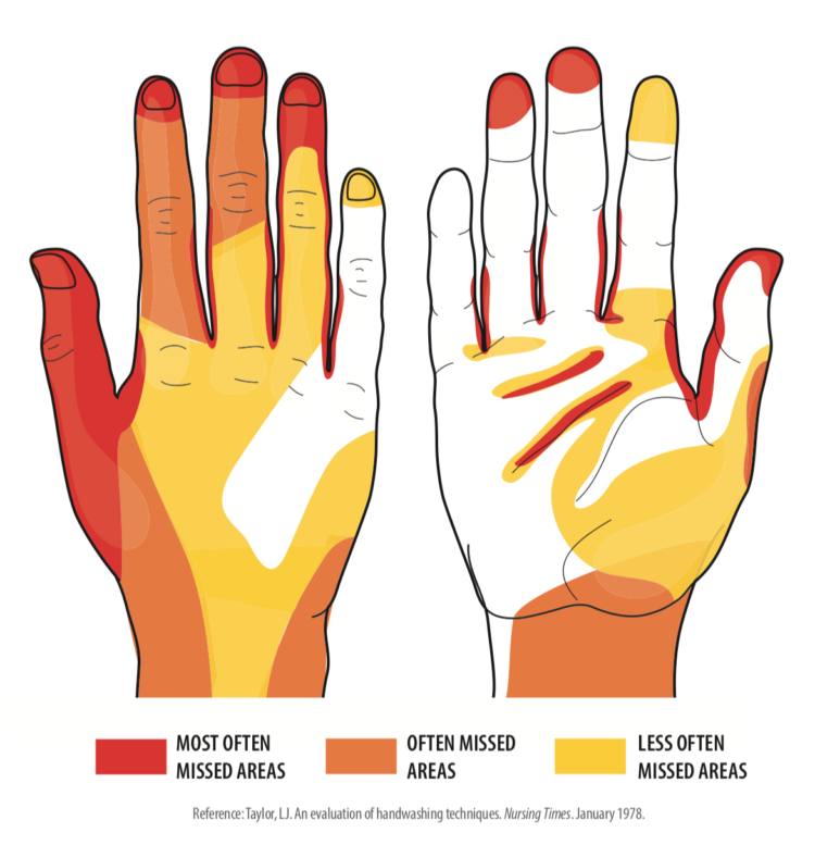
This graphic from WakeMed shows the areas most often missed while washing hands. It’s based on an old-ish study from 1978 by Taylor LJ that evaluated handwashing techniques by health professionals. I’m guessing (hoping) that technique has improved since then.
Also, if there were a diagram based on data collected from the men’s room, the hands would just be completely colored red. Wash your hands, please. It’s kind of important right now.


 Visualize This: The FlowingData Guide to Design, Visualization, and Statistics (2nd Edition)
