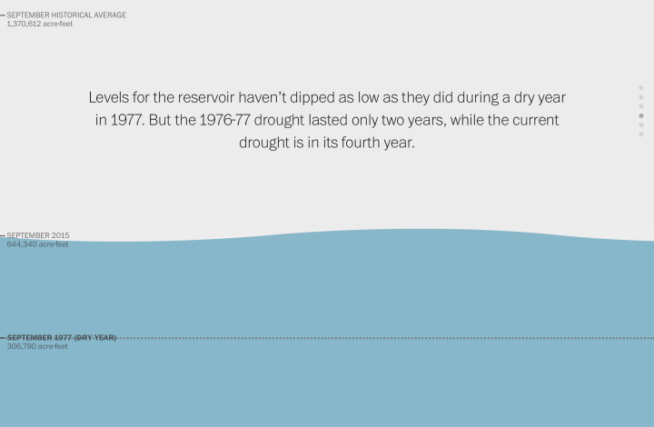
Here’s a nice scroller from Katie Park for the Washington Post. It shows dwindling water levels in major reservoirs in California. At its core, there’s only a handful of data points to look at, but instead of a line to represent the top of a bar chart, Park used an animated water line that makes the numbers feel less abstract. I like it.
Water scroller
Second Edition
 Visualize This: The FlowingData Guide to Design, Visualization, and Statistics (2nd Edition)
 Visualize This: The FlowingData Guide to Design, Visualization, and Statistics (2nd Edition)
New tools, refined process.