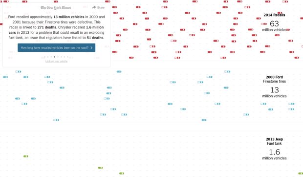
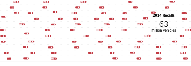
There were a lot of auto recalls — 62 million of them — in the US this year, based on data from the National Highway Traffic Safety Administration. A large portion of them were related to faulty airbags or ignition switches. To compare, there were 20 million in 2013. Still though, we’re not good at picturing big numbers, so Wilson Andrews and Gregor Aisch for the New York Times try to provide a sense of frequency and scale.
An animated freeway of cars runs across your screen. The cars switch lanes and change speed to avoid collisions. This provides a familiar setting for those who drive or ride in cars, along with an individual connection to the large numbers. Then they take you through the data by category. The visual cue is the rate at which cars drive by.

Sure, you can easily represent the data concisely and ever so nicely with a few bars, but I’m not sure many people would care. This seems like something people should care about.


 Visualize This: The FlowingData Guide to Design, Visualization, and Statistics (2nd Edition)
