Weight loss is a difficult task for many, further complicated with so many diets — Atkins, Jenny Craig, etc — and lack of motivation. Fatsecret aims to make weight loss easier by providing the tools to track your weight loss, write about it, see what others are doing, and share your progress.
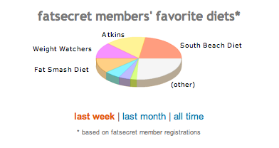
There’s a couple of graphs (built by Flash) on the homepage. The first, a pie chart, shows the proportions of fatsecret users on certain types of diets. You can see the proportions for this week, this month, or all time.
Then towards the bottom — a bar chart showing the average weight loss of fatsecret users for specified diets. Again, you can see for this week, this month, and all time.
Every user has her own homepage which shows a line graph of her progress as well as the average weight loss of fatsecret members on the user’s same diet.
Fatsecret seems like quite of an active site with plenty of posting, tips, and member interactions, which makes me pretty happy. Next step: interactive tools.


Dieters are trying to watch their consumption, and you’re tempting them with pie (charts)? Another reason not to use this chart type.
or could it be that the pie chart is so ugly that it turns people off of real pie?