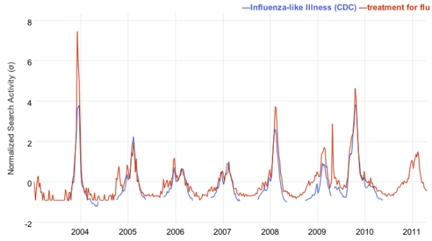
A while back, Google showed how Influenza outbreaks correlated to searches for flu-related terms with Google Flu Trends. It helped researchers and policy-makers estimate flu activity much sooner than with previous methods. Google Correlate is the evolution of Flu Trends in that now you can correlate search trends with not just flu cases, but with your own data or other search queries.
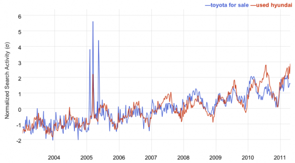
The above, which you already know about, matches flu cases with searches for “treatment for flu.” Similarly, the search phrase that correlates highest with “Toyota for sale” is “used Hyundai,” as shown below.

You can also see how your data is related geographically. For example, annual rainfall (left) strongly correlates with searches for “disney vacation package.” Although, it looks like distance is a strong factor in the latter, which should be a reminder that correlation is different from causation. Google is careful to point this out in their FAQ and explanation of the tool.

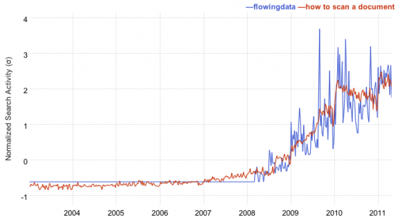
Nevertheless, it’s fun to poke around and sometimes see the non-sensical correlations. For example, the strongest correlation with “flowingdata” is “how to scan a document,” because the growth rates of both seem similar.

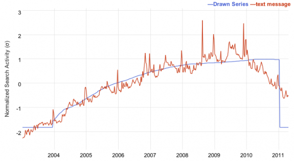
There’s also a search by drawing function. You draw a time series, and Correlate finds terms that best match that trend. In the below chart, I drew a line (blue) that had steady growth, but plateaued towards present day.

What weird correlations can you find?


 Visualize This: The FlowingData Guide to Design, Visualization, and Statistics (2nd Edition)

Twitter apparantly correlates strongly with ‘nail fungus laser’ .. lol…
showing once more that a correlation is no causality ;)
Twitter needs to invest in nail fungus lasers! It’s the key to a prosperous future.
They have Lasers for that? Now that is something to tweet about!
Any API planned for this?
not at the moment
but i am sure they have something in mind for developers
George W. Bush time series shift of 104 weeks… r^2 0.8644 with Flava Flav quotes (5 of top 10 correlations are with Flava Flav) Awesome!
The “Search by Drawing” option is a time waster.
Ah, I missed that one. Kind of fun.
Atheism apparently correlates with the Coca Cola logo. Clearly this is evidence of a plot.
Has anyone managed to figure out a way to make it not correlate search terms with themselves? It seems if you type in anything popular, it just says it’s correlated with variations of the same thing, which isn’t too helpful. For example, it tells me that “iphone” is correlated with “the iphone,” “iphone use,” “but iphone,” etc…
“depression” correlates with “women’s rights” (r=0.9162)
The interface doesn’t really let you look at the correlation (or lack thereof) of two arbitrary terms, which would be nice. So, here are “wine” and “beer” by state, side-by-side :
http://vort.org/2011/05/26/wine-states-beer-states/
The top results for “kittens” include “mango chutney”, “maryland crab”, “toldeo zoo”, and “grilled beef”.
Foreign policy correlates highest with communism…aren’t we past that? :)
Who wants to determine that search that has the highest correlation with “Spurious Regression”?
violent crime per capita and treatment of high blood pressure.
http://correlate.googlelabs.com/search?e=id:h0Jn3dLezwy&t=all
New York times correlates with biased news