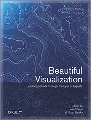
 I finally got a chance to take a closer look at O’Reilly’s most recent edition to their “Beautiful” series, Beautiful Visualization: Looking at Data through the Eyes of Experts, and it’s a good one. In case you’re not familiar, each book in the series is a collection of essays from people who work in the field. Essays range in topic, but they usually focus on a single project and discuss the steps it took to make said project. To be clear, Beautiful Visualization isn’t a how-to book, although you can learn a lot from the writings.
First Impressions
When I first received Beautiful Visualization in the mail and opened up the package, it was smaller than I expected. Height and width are the same as the previous Beautiful Data, but it’s about a third smaller in depth. However, I realized that’s just because they use a different kind of paper (without feeling cheap) and it actually has about twenty more pages than Beautiful Data, coming in at just under 400. All of the images are in full color and big enough so that you can make out the details.
The Authors
There are 20 chapters, or essays rather, by 24 authors. The lineup will tip you off on what you’re in for, and many of the names will sound familiar, as they’ve been mentioned on FD on more than several occasions. There were a few names on the list that I didn’t recognize, but it’s clear that everyone enjoys what they do, and more importantly, enjoy playing with data.
Noah Illinsky, who edited the book with Julie Steele, sets the stage with the first chapter on what is meant by beautiful visualization. Then the rest of the essays get into specific projects and datasets.
For example, Jer Thorp, who was the data artist in residence at the New York Times over the summer, goes into how he made use of the New York Times API.
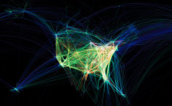
Aaron Koblin, whose work below we all know I am sure, dives into Flight Patterns and how he got into exploring 24 hours worth of flight data.
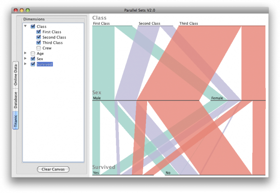
Robert Kosara explains the process of parallel sets.
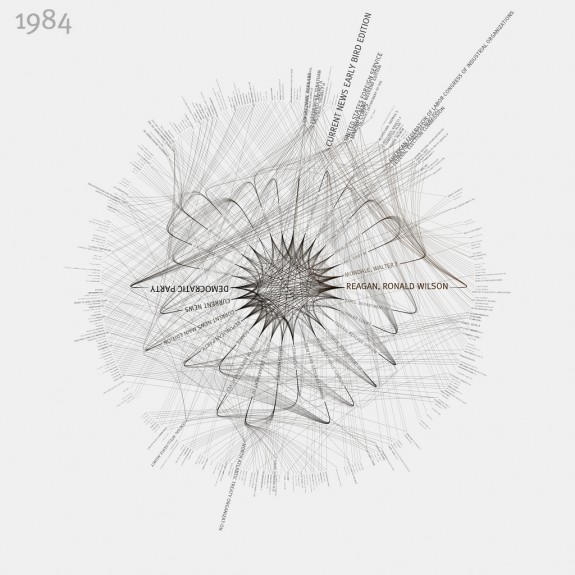
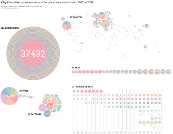
Moritz Stefaner explored submissions to the prix ars electronica over several decades.
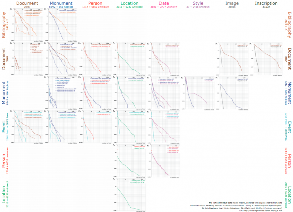
Maximilian Schich uses data matrices to uncover patterns in heterogenous data.
Martin Wattenberg and Fernanda Viegas also describe History Flow, their visualization to show Wikipedia edits, Jessica Hagy briefly covers her index cards, and several others go into detail about how they did things.
Learning About Process
While visualization can get very technical, the authors do a good job of keeping things abstract enough so that you know what they’re talking about even if you’re not particularly experienced in the field. They provide enough detail though that it’s still interesting for others.
A lot of people who are interested in visualization think that’s it’s a matter of learning a bunch of tools, but there’s a lot more to it than that. You’re also learning about data, and learning what questions to ask, and if you don’t know what questions to ask, you just end up with visualization that doesn’t really mean anything. Design also plays a role in in conveying the message you want. So it’s great that there’s a resource that can help you get into the experts’ heads.
If anything, it’s just fun to read about the process of how a graphic or tool gets made. For example, Jonathan Feinberg, who designed the ever popular Wordle, explains what went into the work. Some people like to knock it, but he knows plenty well that the stylized word clouds aren’t the best way to visualize data or extract information, or whatever.
Bottom Line
I’ll tell you what this book isn’t. It’s not a how-to book. It’s not a showcase book with screenshots of a bunch of out-of-context projects. Rather, Beautiful Visualization tells you how some well-known visualizations were made. I do wish there was at least one essay from a pure statistician like Di Cook, but other than that, the author group is a good one. All in all, it’s a good read with interesting subject matter. Thumbs up.


Useful review I’ve been pondering the purchase of this book for a while. After reading your review its now on my wish list :)
Enjoy :)
I have the ‘Beautiful Visualization’ book among others :) I recommend it. Good buy.
Thanks for the review, just ordered! Any news on when Visualize This will be available?
@Guido – There’s a July release scheduled, I believe, but based on current progress, it could be a good bit sooner. I’ll be sure to post about it when I know for sure.
ok cool, keep us updated!
Will it be available on Kindle?
This is a gorgeous collection – I like that emphasis is purely on design, rather than being a reference of instructional how-to’s. This broadens the scope of people that will be introduced to data visualization through an unexpected medium.
I enjoy this book, but one thing I noticed is that some of the projects make better art than information visualizations. Some are hard to understand and some don’t express very much ( though what they express is easy to understand). Overall it is a good book though.