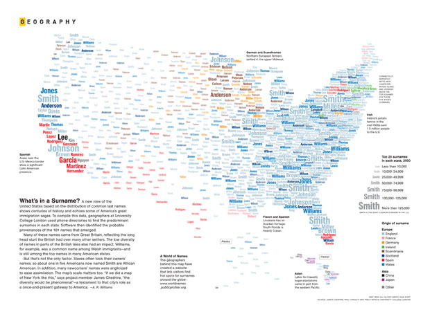
Mina Liu and Oliver Uberti for National Geographic examine the most common surnames across the country:
What’s in a Surname? A new view of the United States based on the distribution of common last names shows centuries of history and echoes some of America’s great immigration sagas. To compile this data, geographers at University College London used phone directories to find the predominant surnames in each state. Software then identified the probable provenances of the 181 names that emerged.
The most common surnames are then placed geographically and colored by origin. Browse the full-sized map here. Is your name in there?


 Visualize This: The FlowingData Guide to Design, Visualization, and Statistics (2nd Edition)

State lines on this would have been really helpful!
Agree with CN … the geography is parse-able but a state line overlay would have helped.
We thought about state lines but it made the map look really messy. The map is so general that (in our opinion) they added very little anyways. Hope you still like it though!
Neat! After Drew Conway’s recent criticism (http://www.drewconway.com/zia/?p=2624) of the usual sort of word cloud, it’s great to see people exploring ways to use the two dimensions to mean something.
See also the critique on Junk Charts
Yeah, the critique seems right-on. I really just thought it was neat they were using the two dimensions to mean *something*. But yeah, lots of room for improvement.
I have responded to the excellent Junk Charts post here: http://spatial.ly/fG8axi