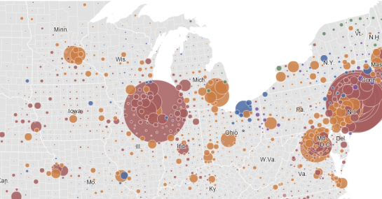
Remember our short contest a while back with immigration rates to the United States? The New York Times digs deeper with their Immigration Explorer. It’s an interactive map that lets you browse immigration rates since 1880. Counties are colored by the largest foreign-born group according to percent of population. You can also explore by number of residents.

Scroll the top bar left and right for decade; zoom and pan the map to focus on a state; mouse over counties for foreign-born population vs total population; change bubble size as you look at immigration counts; or select a specific country for a different view. It really does let you explore the data, which by the way you can find most of at Social Explorer.
You’ll notice a large portion of immigrants are from Europe and Russia in the earlier decades, but as you come closer to the present the country appears to diversify as well as an increase in counties with large Asian and Latin American populations. Of course, this is exactly what we should expect. It’s what we saw in all the stacked plots, bar graphs, time series plots, and maps from our contest.
[Thanks, Scott]


Very cool visualizations. I continue to be amazed by the quantity and quality of data visualizations produced by the folks at the NY Times. Any idea if the technology/libraries they’re using to create these geographic visualizations is available, or if it’s something proprietary that they’ve developed themselves?
@Steve – They use ArcGIS to build the maps and then read them into Flash/Actionscript. I’m not sure what AS libraries they use though.
I love the visualisation, but I’d love it even more if they’d used the correct historical county boundaries.
My students and I estimated that this visualization tool is driven by more than 927,072 data values (3219 county equivalent areas * 12 census dates * (23 places of origin + 1 summation)) – plus millions of coordinate pairs that define the shapes of the enumeration units and centers of each graduated circle.
Yet, in less than 2 minutes, my students were beginning to make effective comparisons, identify trends, and recognize anomalies (and they loved the bubble control). The tool has a high content-to-ink ratio, is very easy to use, and (in my opinion) uses color very effectively. These attributes, I believe, are the hallmarks of a successful visualization tool. Kudos.