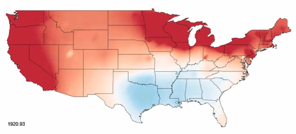
Political science PhD candidate David Sparks has look at the evolution of the two-party vote:
Using county-level data, I spatially and temporally interpolated presidential vote returns for the two major party candidates in each election from 1920-2008. The result illuminates the sometimes gradual, sometimes rapid change in the geographic basis of presidential partisanship.
David notes further:
This animated interpretation accentuates certain phenomena: the breadth and duration of support for Roosevelt, the shift from a Democratic to a Republican South, the move from an ostensibly east-west division to the contemporary coasts-versus-heartland division, and the stability of the latter.
More broadly, this video is a reminder that what constitutes “politics as usual” is always in flux, shifting sometimes abruptly. The landscape of American politics is constantly evolving, as members of the two great parties battle for electoral supremacy.
Watch it play out in the video below.
[David Sparks via @statpumpkin | Thanks, David]


 Visualize This: The FlowingData Guide to Design, Visualization, and Statistics (2nd Edition)

With regard to the use of red and blue here:
http://en.wikipedia.org/wiki/Red_states_and_blue_states
For the love of beauty, project that map!
I wonder how closely other two-factor social variables (hi-/low-population density, state immigration/emigration, etc.) would mirror the same pattern.
Yes! My inner geek would love to see an animated residuals map.
I really can’t understand this map very well. For example, the 1960 election was one of the closest ones, and the Republicans won 26 states. Yet for most of 1960, the map is just various shades of blue, without a trace of red.
Have you seen the Voting America project that was created by the Digital Scholarship Lab at the University of Richmond? It uses similar data, along with many other points of data that can be selected by users to tease out trends. I highly recommend it for researchers looking at US election data over time, as well as anyone who enjoys playing with this type of visualization.