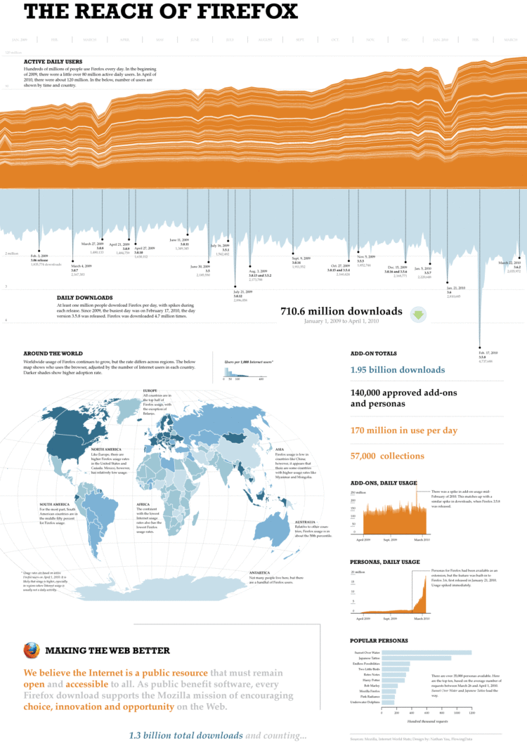
Once every blue moon I like to freelance as a short break from school work, and a few months back I got an email from Mozilla that basically said, “Hey we’ve got a lot of data. Do you want to do something with it?” Luckily, the scheduling worked out, and this was the result.
We have active daily users on the top, mirrored by daily downloads on the bottom. Notice the holiday dips and the spikes with each new release, with an overall trend of up? Geographically, the map shows an estimate of Firefox users, normalized by Internet users in any given country. The darker the region, the higher the usage. Finally, on the right, we have a rundown of personas and add-ons.
In short: a lot of people around the world use Firefox.
See the full version here.
In case you’re wondering, all the charts were done in R. I made the map with indiemapper. After that, I brought all the bits into Adobe Illustrator, and tada, there it is: a nice, pretty data poster for the recently past Firefox Summit.


 Visualize This: The FlowingData Guide to Design, Visualization, and Statistics (2nd Edition)

It does not answer everyone’s first question: what is their share of the browser market?
well the map shows firefox users per 1,000 internet users on a given day. I think it’s safe to assume that the remainder of the 1,000 are using non-Firefox browsers.
That’d make sense- since it’s hard to tell the exact number (or maybe I’m missing it), it looks like that’d peg the U.S. around 10%-20% browser share for FF…
(Where) can we get the raw data?
Excellent infographic, Nathan. Nice to see that it’s entirely possible to do an infographic *and* stick within the realms of quality visuals.
@Andrew – that wasn’t my first question! My first question was about the REACH of Firefox. Why? Because that’s what the title of the graphic said – the title desribes the purpose of the graphic and subtly tells me, as the viewer, what to expect.
I really liked the infographic Nathan! It’s interesting to see how Firefox is spread accross the world.
I have a question, what do the layers in the areachart mean? I think it might be the country but I’m not entirely sure.
@Nicolas – Yeah, you’re right. My intention was to label the countries, but it got cluttered in a hurry, and it felt like an all or nothing thing. I left the layers in for effect and let the map take care of geography.
Pingback: Microsoft and Blackberry plan new iPad rivals « V E X E D
I am curious if you can give some insight for the area chart showing usage by country over time. What is the reason for the almost synchronous crest and fall of Firefox usage across all the countries of the world? Do dips coincide with major releases of competing browsers?
Congratulations, Nathan. Looks great! Any insight on the big spikes in downloads at various times? Do they coincide with some new-related event?
Nevermind about the downloads, I initially misread the chart.
Yep, users on the top – hence the dips during the holiday seasons. And downloads on the bottom – with spikes each Firefox release.
I wonder if the relatively low usage rate of Firefox in Norway (compared to other Western, Southern, Central, and Northern European countries) is due to a highly visible national presence of the Opera browser, which was developed by and for the nation’s telecom industry in the mid-1990s… Anyone have any data that might support this hypothesis?
Actually, Firefox has about 30 percent of Norway’s browser market share, Opera 7%. However, Opera is the number one browser in Kazakhstan, Uzbekistan and Belarus, where it enjoys a 47 percent market share.
http://gs.statcounter.com/#browser-NO-monthly-200907-201008
http://articles.chicagotribune.com/2010-06-15/business/sc-biz-0616-browser–20100615_1_google-chrome-browser-linus-upson
Liked it overall. I found the continental caption text superfluous – it’s only restating what’s already readily obvious from the visuals. The download peaks pointing down felt… a little weird, but I have no suggestion how to improve them, given that they correspond to the volume time line.
Pingback: ABSOLUTMATERIALIST » THE REACH OF FIREFOX
Is it possible to breakdown the countries down by region/state? It would be interesting to know what the distribution looks like among the different states. Is usage higher in one part of the U.S., or is it even across all states?
Pingback: Linkpeitsche » Der Mittwoch
Watch out, FF, chrome is coming for ya.
Pingback: Exploring the Reach of Firefox « RedSpiral
Pingback: Mega Weekly Links 8.6.10 : Otaku Journalist