UN votes to support map projection that accurately shows the size of Africa
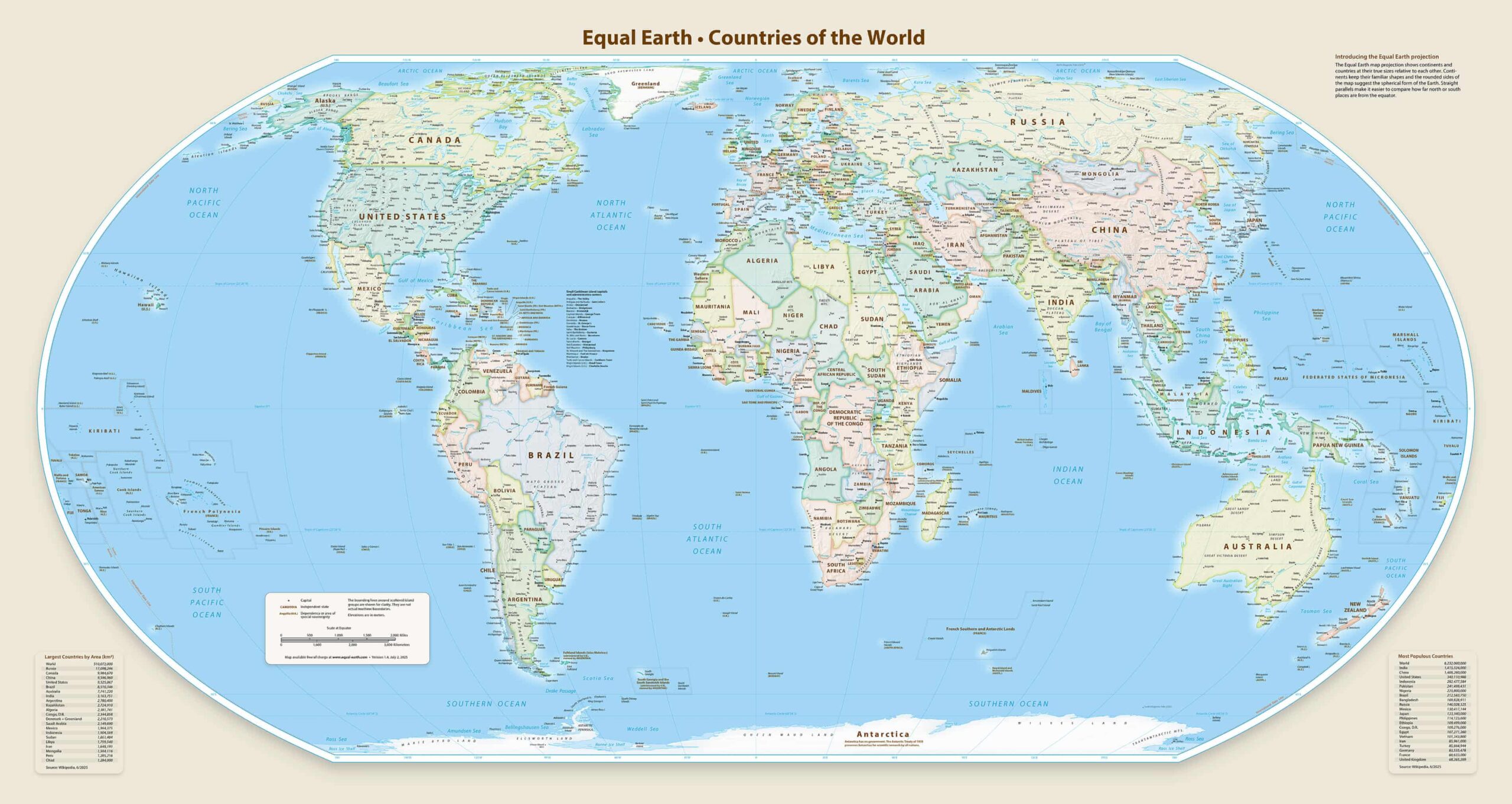
Last year, the African Union pushed for wider adoption of the Equal Area map projection so that the size of Africa is more accurately shown around the world. A few days ago, the United Nations voted in favor of the more accurate projection.
For the Guardian, Eromo Egbejule reports:
At the session, 164 countries voted in favour of the resolution. Only the US voted no, with its representative saying the resolution was “superfluous”. There were six abstentions.
UN resolutions are non-enforceable, so countries and institutions will not be mandated to use only the new projection or forbidden from using the old one. However, the outcome is expected to result in an update of classroom curriculums and everyday technology given the wide usage of the Mercator projection in education, technology and governance.
The Mercator projection, which is good for local directions, makes Africa appear much smaller.
See also from last year: a primer on projections and the math that affects how regions are perceived.
Become a member. Support an independent site. Get extra visualization goodness.
See What You Get