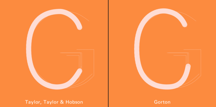
Marcin Wichary dives deep into the Gorton font, calling it the hardest working font in Manhattan.
The history of this strange font spans over a century and I’ve seen it in so many countries by now, used in so many situations. But it’s impossible for me to say Gorton is the most hard-working font in the world.
To this title, there are many contenders. Garamond has a head start of 300+ years and has been released in more versions than letters in any alphabet. Helvetica is so famous and used so much that even its ugly copy, Arial, became a household name. Whatever font MS Office or a popular operating system appoint to be “the default” – from Times New Roman through Calibri to Roboto – immediately enjoys the world premiere that any Hollywood movie would be envious of. There is even a 5×7 pixel font originally started by Hitachi that you can see everywhere on cheap electronic displays in cash registers and intercoms.
But there is one place in the world where Gorton pulls triple duty, and I feel confident in saying at least this: Gorton is the hardest working font in Manhattan.
There are many pictures and diagrams, but my favorite part are the interactive bits that let you type letters to see and compare characters.