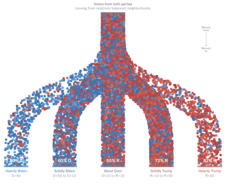
For NYT Upshot, Ronda Kaysen and Ethan Singer compared current voter registration data against 2020 data to estimate how people moved away from politically balanced neighborhoods. Those who voted for a given party were much more likely to move to places that were similar politically.
Particle-based flow charts are used to show the movements. They initially show Democrat and Republican moves separately, which provide percentage breakdowns between levels of political leanings. The percentages in the combined view above are less clear though. Are they the percentages of people who are affiliated with a party in those areas now?
In any case, the increased polarization doesn’t seem great for the country.


