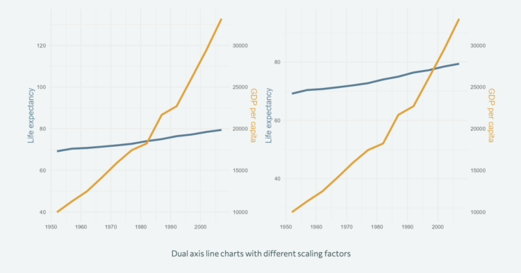
Nicola Rennie provides five quick tips to improve on default axis scales:
[T]he choice of axes can have a big impact on the clarity of your visualisation, and that relying on the default settings of software isn’t always a good idea. Are there blanket rules about axes that you can apply to every type of visualisation? No. Instead, I’d advocate for having a little bit of common sense and actively thinking about your design choices. Think about the context of what you’re trying to communicate, and whether or not your data visualisation of choice communicates that effectively and honestly.
When I hear “common sense” I’m reminded of when my dad would tell me to use common sense when I did something that didn’t make much sense in retrospect. Whatever I was doing seemed like a good idea at the time. So I’d argue not to use common sense with your axes, but to avoid defaults by default until you develop a better feel for how to communicate with data.


