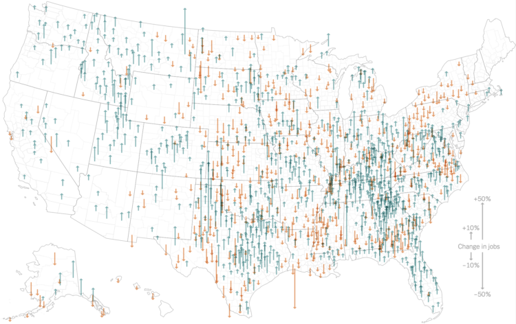
To show the counties with more or fewer jobs when comparing 2023 to 2019, Ben Casselman and Ella Koeze for the New York Times use a county map with up and down arrows. Green and up means a gain, whereas orange and down means a loss.
We’ve seen similar maps with arrows, but they’re usually angled or swooped. I guess I always assumed arrows going straight up and down would jumble together, but this seems to work.


