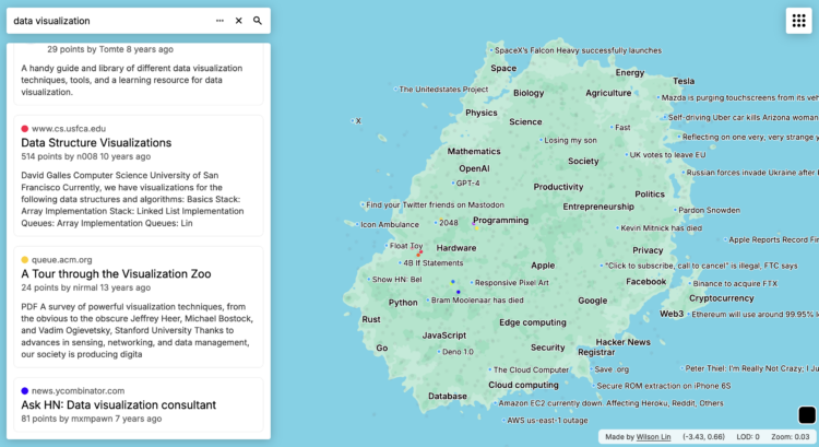
Wilson Lin used an abstract map to visualize 40 million posts and comments from Hacker News. He calls it the Hackerverse. Lin described the full process of scraping, using text embeddings to map words to locations, and making an interface that worked with thousands of points:
What can we do with the 30 million comments? Two things I wanted to try to analyze at scale were popularity and sentiment. Could I see how HN feels about something over time, and the impact that major events has on the sentiment? Can I track the growth and fall of various interests and topics, and how they compare against their competition?
 Visualize This: The FlowingData Guide to Design, Visualization, and Statistics (2nd Edition)