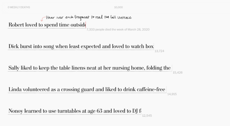
Alyssa Fowers and Leslie Shapiro, for The Washington Post, used the stories of 114 individuals to show weekly Covid deaths. Each story is “cut short”, making the length of each fragment match counts for the corresponding week.
My brain was slightly confused by the metaphor at first. The lower the count, the more an individual’s story is cut short, but my intuition expected that more deaths would mean stories were cut short more.
That said, the sentiment is in the right place. Maybe the stories didn’t need to be tied to weekly counts? I’m imagining something closer to Periscopic’s piece from 2013 on lives cut short by guns.
 Visualize This: The FlowingData Guide to Design, Visualization, and Statistics (2nd Edition)