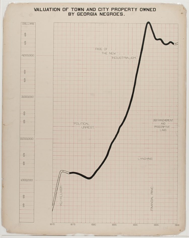
The visualization work of W.E.B. Du Bois and his students has been on FD before, but it’s worth another look. In 1900, they put together a series of charts for a Paris exhibition visualizing black America. You can access the collection via the Library of Congress.
If you’re looking for more context for the charts and the times, Whitney Battle-Baptiste and Britt Rusert wrote about the history and motivations in W.E.B. Du Bois’s Data Portraits: Visualizing Black America. On the line chart above:
What appears to be another straightforward line chart is one of the most overtly political charts in the Georgia study. An undulating black line shows extrapolated property values in outline and actual property values in solid black crossing a red grid of squares. Tucked into the grid is a series of disquieting socioeconomic and political trends: the rise of the Ku Klux Klan and political unrest in the 1870s; new industrialism in the 1880s; followed by lynching, financial panic, disenfranchisement, and proscriptive laws in the 1890s. The diagram powerfully links the economic progress of black Georgians to larger regimes of violence against African Americans, pointing to the widespread disenfranchisement and dispossession of black people in the post-Reconstruction era.
Again, this is from 1900.


