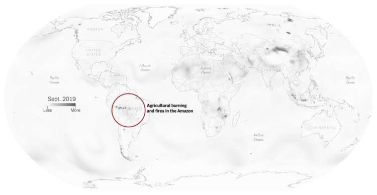
High air pollution can lead to serious health risks, but you can’t usually see particulate matter floating in the air around you. So we have no base for comparison and only an abstract sense of what’s bad and okay. The New York Times tries to make the pollution more visible.
They lead with moving particles across your screen at a density that matches approximately to what the Environmental Protection Agency defines as “good” air quality. Then the number of particles increases to peak air pollution in your area this year. Then the density increases again for the really bad areas around the world.
So you get a baseline, a relatable point with geography, and then a point of perspective.
Be sure to check out the piece on your phone (only on updated iPhones?) to get the augmented reality view. Whoa.


