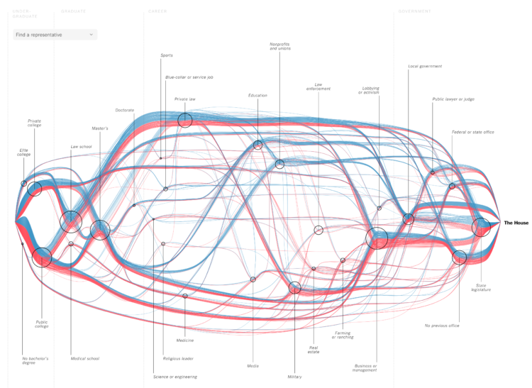
For The New York Times, Sahil Chinoy and Jessia Ma visualized the path to Congress for every member. See it all at once like above or search for specific members. The vertical scale represents previous categories of work and education and looks like it’s sorted by how common the categories were among Republicans and Democrats. The horizontal scale represents time, which starts at undergraduate and finishes at the House. Nice.
See every member’s path to the House of Representatives


