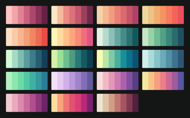
Picking colors is one my favorite things to do with visualization when I’m not in a rush for time. But when I can spare the minutes to pick and choose, it’s useful to have a quick reference. ColorBrewer is the go-to, but CARTOColors is a simpler take. It just shows you a bunch of schemes at once for sequential, diverging, and qualitative data. [via @maartenzam]
CARTOColors is a quick set of color schemes to copy