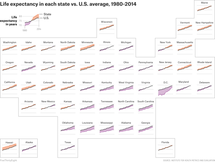
FiveThirtyEight continues their look at mortality by geography. This graphic by Anna Maria Barry-Jester compares life expectancy over time for each state. Purple means below average and orange means above.
The good news is that all the lines trend upward. The bad news is that some states are trending upwards much more slowly than the rest.


