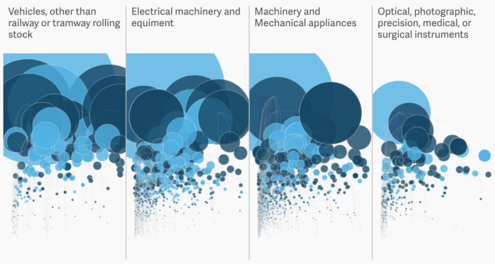
Most goods imported from Mexico are untaxed under the North American Free Trade Agreement. The Administration wants to tax those billions of dollars of goods coming in. David Yanofsky for Quartz plotted the imported products.
Quartz gathered import data from the US Census Bureau comprising 6,011 hierarchical product categories, the amount imported, and the tax collected. Every product the US buys at least $1 million worth from Mexico is shown below through the lens of the Harmonized System, the international standard for categorizing and taxing traded goods.
The x-axis shows the percentage of international imports for a product come from Mexico. The y-axis, as well as bubble size, shows how much the US spent in the year November 2015-2016. Color represents tax rate.
The hierarchical representation confused me at first. We typically see bubble plots charted on three dimensions from a flat, rectangular dataset. That is, there’s an x-value, a y-value, and a z-value (for bubble size), and each bubble represents a separate category. However, with this representation, each smaller circle is a subset of a larger circle.
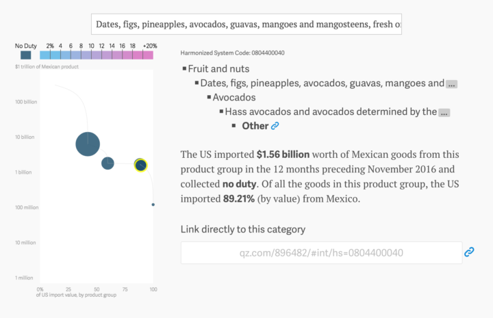
For example, here’s the plot for avocados:

It’s a plot with five bubbles, which starts with the fruit and nuts category and goes down to a certified organic Hass avocados subcategory. So there’s the hierarchy, the x-y position, bubble size, and color. The color scale represents 0% to 20%, but only the really tiny bubbles fall in the high range, and at that point it’s hard to see what color it is.
I think it’s a good concept. But it might try to show too much at once.


