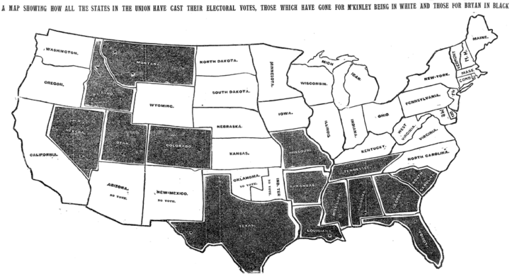
Every election, there’s a slew of election maps that come in all shapes and sizes. The maps have evolved with the web, the amount of data available, and the level of reader interest, and it’s about finding a balance between the new and what works. To see the evolution, you can look to The New York Times portfolio over the decades. The Upshot has the rundown.
All the ways to map election results


