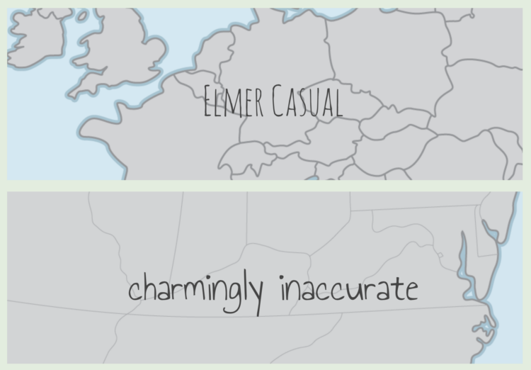
You’ve probably seen those “maps” where people from other countries draw the United States and end up with a wobbly New York, Los Angeles, and some stuff in the middle. Here’s what happens when cartographers draw boundaries by hand. It’s called Project Linework.
[T]he power of cartography (and its purpose) is that it’s not realistic. It’s highly abstracted and generalized, and reality went out the window once we decided to show a road as being red and give it a stroke width that makes it look hundreds of miles wide, or to replace a city with a black circle. We stylize so many other things on maps, but playing around with the actual shapes of states, islands, or roads, is uncommon. I’d like that to change. I want to shake things up, because I think that people become too familiar with the shapes of states and countries and the like. They’re default, unobtrusive. It’s hard to call attention to places when they always look the same.
Download the hand-drawn boundaries, in styles such as Elmer Casual and Wargames, in various formats to suit your needs. [via National Geographic]


