In many parts of the country, the departments of health require that eating establishments put up posters that instruct you what to do in case someone is choking. The posters are government-issued, but some people are putting up redesigned posters that fit in with restaurant decor. The Sideshow Podcast covers the trend and some of the ridiculous posters to come out of it.
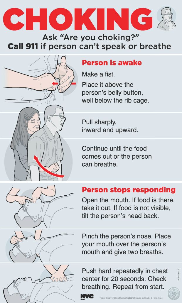
For example, the official poster in New York, designed by New York Times graphics director Steve Duenes, is shown below. It’s straightforward and to the point. The guy in the glasses also looks really smart.

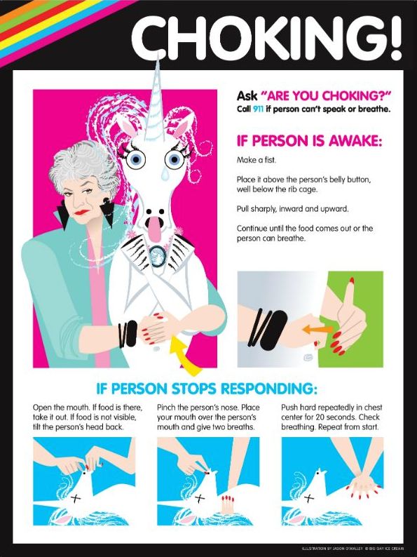
Now here’s one of Golden Girl Bea Arthur providing the Heimlich maneuver to a choking unicorn, by Jason O’Malley. The text is the same. The illustrations are different.

You know, the look of red fire extinguishers are starting to look a bit old and drab too. Someone should make custom covers for those things so that they don’t stand out so much. That way during an emergency we won’t get stuck scoffing at interior aesthetics anymore. Boom. Problem solved.


