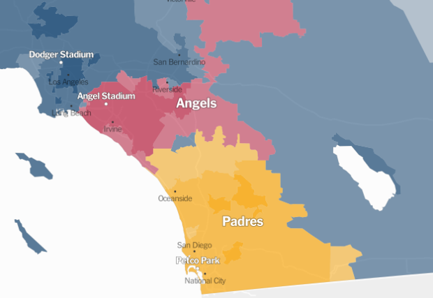
For the past couple of sports seasons, Facebook mapped the most liked team by county. They did it for football (NFL), the NCAA basketball tournament, and baseball (MLB). Although generalized, the maps provide a view of sports fandom and people clusters across the country, and plus you know, they’re fun.
The Upshot used the same like data, provided by Facebook, and mapped it at the ZIP code level. Then they took it a step further and looked closer at regional rivalries, such as Cubs and White Sox, Yankees and Red Sox, and Dodgers and Angels. Be sure to scroll down to Mets versus Phillies. They incorporated a tidbit of Josh Katz’s dialect map.
The Upshot is off to an impressive start. It’s almost as if The New York Times people have been doing this for a while. [via @KevinQ]


