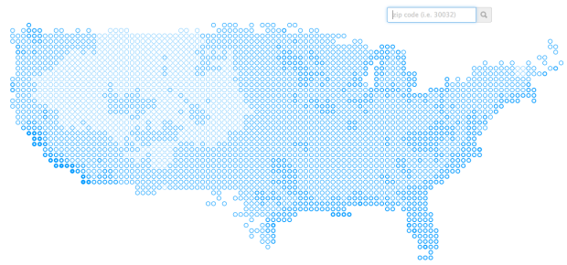
We’ve seen plenty of maps the past few weeks that show how bad the weather is, in just about everywhere but California. Kelly Norton looked at it from the other direction and estimated how many pleasant days per year areas of the US get, based on historical NOAA data.
I decided to take a stab at what constitutes a “pleasant” day and then aggregate NOAA data for the last 23 years to figure out the regions of the United States with the most (and least) pleasant days in a typical year. The results, I think, are not that surprising and pretty much affirm the answer given off the cuff by many of my west coast friends when asked about the best places, “Southern California?” For the areas with the least pleasant days, I admit I would have guessed North Dakota. However, it’s much of Montana that gets an average of a couple of weeks of pleasantness each year.
Of course the map changes (mainly the geographic range) depending on the definition of a “pleasant” day. In this case it’s defined as one where the mean temperature is between 55 and 75 degrees.


