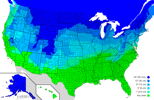
Someone ended an email to me last week with “Stay warm.” Not to sound like a jerk, but I happened to be answering email outside with my t-shirt on and sweater slung over the chair. I was also half-wondering whether I should change into shorts. Anyway, this map by Alexandr Trubetskoy, or reddit user atrubetskoy, might be of interest to many of you not in California. It shows an estimated amount of snow required to close school for the day, by county.
The estimation methods seem fuzzy based on the comments, so I’d stick with your local news for real updates, but the regional spread is still interesting to see.
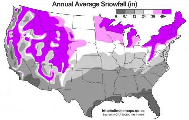
For the most part, it looks like average snowfall, as seen in the map below. At first the midwest looks like it doesn’t quite match the one above, but note that white is the middle of the color scale rather than an indication of zero.

This makes sense. After all, school cancellation is the result of more snow than an area is used to handling. When I was kid living in California, we went crazy with a quarter inch of snow. In Buffalo, the snow removal is so good that everyone just moves along no problem, even with a foot of snow overnight.


 Visualize This: The FlowingData Guide to Design, Visualization, and Statistics (2nd Edition)
