The Guardian posted a small collection of useless infographics. It kind of looks like my suggestion inbox.
Useless infographics
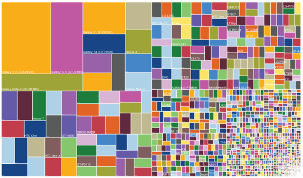
The Guardian posted a small collection of useless infographics. It kind of looks like my suggestion inbox.