Available in print. See also: a video version. Still no confirmation for whether or not if Batman in fact does smell or if Robin laid an egg.
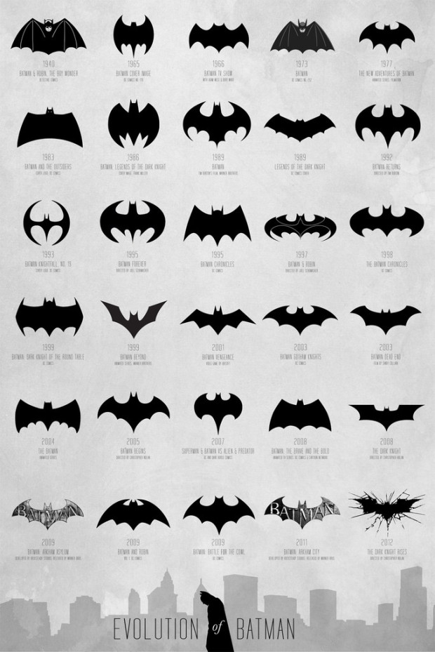
Evolution of Batman logo, 1940-2012


Available in print. See also: a video version. Still no confirmation for whether or not if Batman in fact does smell or if Robin laid an egg.
Just checked the Bat Computer and the 1989 Batman film logo is incorrect. It more closely resembles the logo in the Batman Chronicles 1998 position.
The 1989 logo is the logo embossed on Michael Keaton’s batsuit. Why it’s shaped differently I don’t know, but it’s probably worth counting as a chapter of Bat-history.
;)
This is cool. I am not aware that the batman logo had undergone so many changes. On the other hand, I am not really fond of the 2012 logo.
1986 is not Legends of the Dark Knight (which started in 1989). Its from The Dark Knight Returns.
Nice but are “evolution” or “logo” really the right words for this? It’s not like the evolution of a corporate logo, because there’s no single “official” Batman emblem at any given time. It looks to me like every creator in every medium just comes up with his own twist on the design.
1998 logo is my most favorite one.
what next?
83 and 93 are crazy.