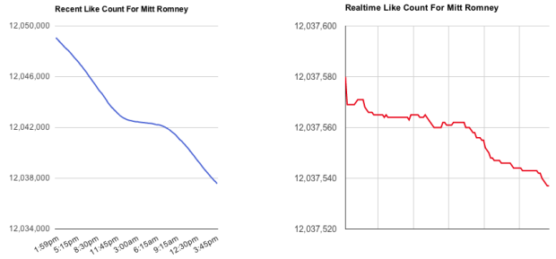
If you go to the Facebook page for Mitt Romney, note the number of likes, wait a few seconds, and then refresh the page. The number of likes is decreasing fast enough that you can see the change over a short period of time. Disappearing Romney charts the change in real-time.
Tick, tick, tick.
See also Who Likes Mitt, with the quick API hack on github. [via @moebio]


Well I’m not a fan of Romney either but seeing this is a blog about datavis I’d expect at least a sidenote here about how the scales are being somewhat manipulated.
That was exactly my first thought. That lovely plunging blue line is one-tenth of a percent of the total, and the red…a whopping 3/10,000ths of a percent.
This isn’t even statistical noise, and it’s no more informative that watching the sands fall in an hourglass.
What might have actually been interesting would have been to watch both Romney and Obama’s likes *increasing* over the last few months, and look at comparative rates of change.
Click through to the sites. The rate of unlikes is the point of interest here.
The scale on this is horrible. Zoom in close enough to data, and you’ll see anything. You’ve manipulated the data to make it look like it’s a huge change, but the drop represents just 0.001% of his followers (12K out of 12M).
can you see connection of this article to https://flowingdata.com/2012/08/06/fox-news-continues-charting-excellence/ ?
Bars are different than lines. In bars, it is _never_ ok to have the baseline anywhere other than zero because we visually compare the colored in area and the ratio of areas should be the ratio of quantities. For line charts, sometimes it is ok to use a non-zero baseline if what is being shown is a trend. In this case, it seems that is exactly what is intended: to show that there is a trend of Mitt losing likes.
Then the question is, are these data points really representative of a trend, or is this just “statistical noise” like sniffy says above? Since the number of likes is so consistently decreasing over the interval shown, I think it’s fair to say that there is a trend of Mitt losing likes.
Is this trend going to continue long enough that nobody will like him? Here is where you can look at the portion of his likes that he has lost. Even if he continued losing likes at the same rate, it would be a while before he hits zero.
As it turns out, I made an app that shows side by side comparisons of Facebook pages winning or losing a race to gain new Likes. It’s called Like Race, or Fan Race, or something like that. This is a link to the Obama/Romney race. I created the winner at 200,000 for yesterday. Mitt had -50,000 likes and Obama had 200,000 likes. Though, that always happens to winners and losers in political races. Mitt’s political career could be over, and he’ll most likely retire, so there is no need to “like” him on FB anymore. Here is the link to the race, you can watch it in real time:
http://apps.facebook.com/likerace/?page=race&id=489065135
It seems that anyone complaining about the scaling of the y axis here is
1) completely missing the point
and
2) not clear in their understanding of how axis scaling for line charts works…
This was set up to simply show the real time status of the Romney’s facebook likes.
It was not presented as ‘ZOMG everyone hates Romney!!!1’
It’s interesting to see in real time, and it is charted appropriately to facilitate that goal.
And that’s about it…
The opposite seems to be happening to Obama. I sat there and refreshed his page and there were a few more added each time.