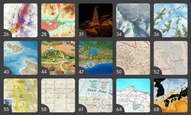
In the Atlas of Design, published by the North American Cartographic Information Society, Timothy Wallace and Daniel Huffman argue for beautiful maps that are a joy to examine.
Design and aesthetics matter, because form is not secondary to function; form is integral to function. A map cannot function if it remains unread. To truly engage map users requires that we present them with something worth looking at. Something that they will want to spend time studying. Something that acknowledges the human need for beauty. Something that causes the user to think about the map in terms beyond whether or not it simply “works.”
Yep.


From the great book Universal Principles of Design, on the “Aesthetic-Usability Effect”:
“…people perceive more-aesthetic designs as easier to use than less-aesthetic designs – whether they are or not. The effect has been observed in several experiments, and has significant implications regarding the acceptance, use and performance of a design”
Aesthetics build acceptance and trust, which means people will be more likely to invest energy into diving into something like a map, because they have more reason to expect their efforts to be rewarded. When they encounter difficulties, which will happen any time they are stretching a visualisation to its limits, they will be more likely to persevere. They’ll work harder with it, and get more out of it. Aesthetics also aid use and performance, as if it’s easier on the eye and just feels right, it’s easier on the mind to process.
Also from the same article:
“Positive relationships with a design … catalyse creative thinking and problem solving. Negative relationships… narrow thinking and stifle creativity.