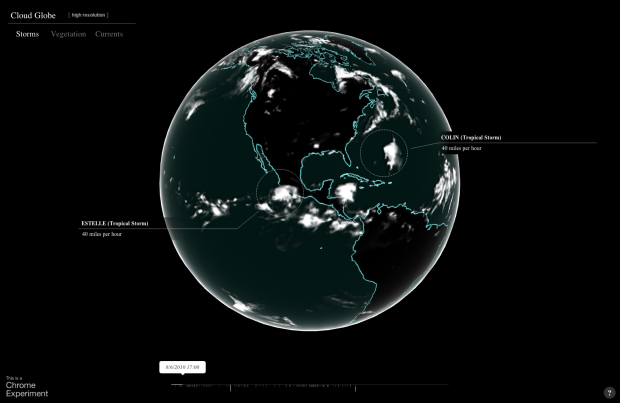
In the latest Chrome experiment, Google mapped cloud coverage around the world in Cloud Globe. The interactive animation shows coverage from July 1, 2010 to September 12, 2012, with a globe that you can move around as expected and a timeline on the bottom that indicates high levels of coverage. As the animation plays through, storms are highlighted with a circle and pointer. Finally, you can turn on the vegetation layer, and the green regions happen to be under the clouds. Imagine that.
Global cloud coverage