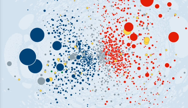
The Wall Street Journal visualized major political contributions, according to the Federal Election Commission, in a piece they call Political Moneyball.
Based on the money sent between the players (and other characteristics like party and home state), our presentation pulls players toward similar players and pushes apart those that have nothing in common. The players who are most interconnected (like industry PACs who try to make alliances with everyone) end up close to the center. Those who are less connected (like a donor who only gives money to Ron Paul) are pushed away from the center.
Analysis was powered by CartoDB, and the network by Tulip.
The challenge with these network graphs that have lots of nodes and edges is narrowing down what’s useful. With yesterday’s Internet map it’s easy to relate, because you just search for the sites of interest, and the large ones such as Facebook and Twitter provide context.
However, with Political Moneyball it’s tougher, because there are so many entities you’ve never heard of. My suggestion: Start with the examples section (such as who the National Rifle Association supports) in the sidebar, and go from there. It’ll be much easier to get into it.


Entertaining – by looking for NRA with your link, and then switching direction (who gave money TO the NRA), there is one small org listed. It’s OSI Restaurant Partners. Weird, I thought – and then it turns out they really gave money to the National Restaurant Association, if you look at THEIR network. Data bug, I guess.
Er, hard to tell, actually: the OSI supposedly gave to both orgs. I think more investigation is needed here :-)
Thanks for sharing this. It’s a cool visualization, but I don’t find it the most intuitive or functional to use. Sometimes I think newspapers are so interested in whiz bang that they forget how simplicity is best, especially if you’re reading quickly on the web.