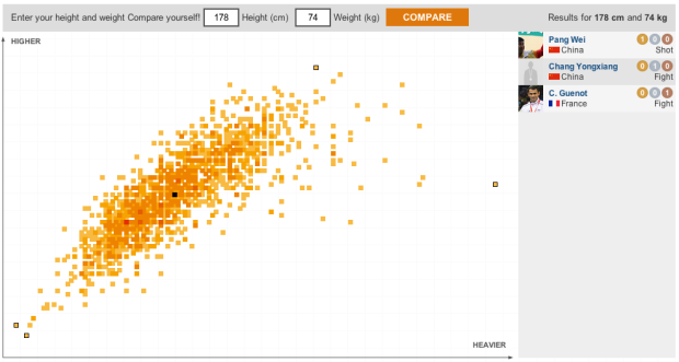
I think the theme of this year’s Olympic graphics is how you relate to athletes. In this interactive by the BBC (in Spanish), height and weight of medal winners from the last Olympics in Beijing are plotted against each other. The more red, the more athletes with that weight-height combination, and you can click on a square to see the corresponding athlete(s). The twist is that you can enter your own height and weight to see where you are in the mix.
Combine this with the recent age piece from the Washington Post, and you’ve got a more complete picture. Why stop there though? I want country, gender, and hair color breakdowns. [Thanks, Ben]


Hi there,
Thanks for your kind word. We have done about 15 versions of that project for BBC World Service language websites. This article will tell you more about the process. http://www.journalism.co.uk/news/telling-the-user-s-story-how-the-bbc-world-service-is-using-special-interactives-in-olympic-lead-up/s2/a549768/
Thanks,
Dmitry Shishkin
BBC World Service Development Editor