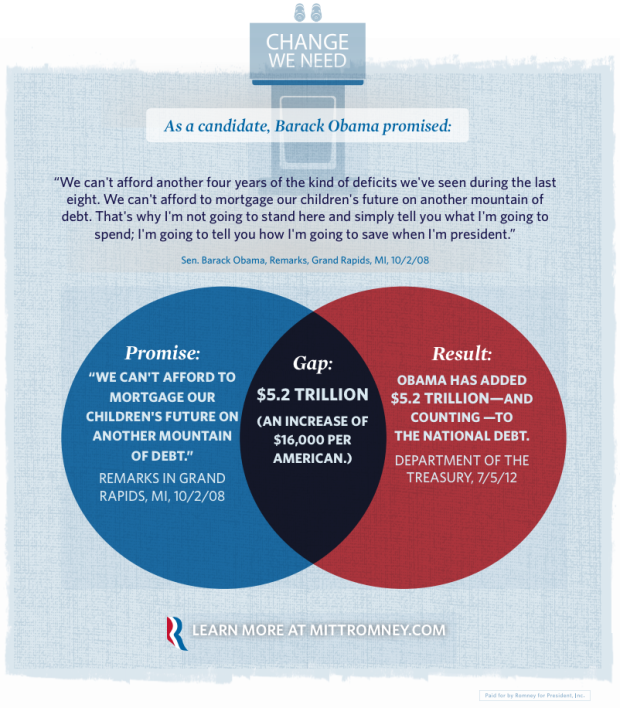
The Mitt Romney campaign put this venn diagram up a few days ago, aiming to show the “promise gap.” On the left is an Obama promise, and on the right is the result. In the middle, the combination of the promise and the result, is the gap. Wait, that’s not right.
Mitt Romney pseudo-venn diagram, used incorrectly


hilarious
the venn diagram would be perfectly okay as an experiment for Massachusetts, but he never intended this design for a national audience
:-D
Either this is an in-joke I’m not in on or you meant “pseudo”.
good data, bad diagram.
“…that’s why I’m not going to stand here and tell you how I’m going to spend; I’m going to tell you how I’m going to SAVE….” -Obama
I think he means spend, not save. His form of “SAVE” is kind of like “SAVING” on a discounted purchase or opportunity spending rather than cutting back on more purchases.
But that being said, bad use of the Venn Diagram. [Almost reminds me of the MasterCard logo. ….or maybe that’s intentional?]
It’s truly discouraging. The level of anger has gotten so high that it’s impossible to even mention Bama brand apple butter, let alone this nation’s President, without enflaming the Foxified.
Patrick,
I’m sorry. My comment wasn’t intended to inflame. I do appreciate open dialogs from opposing or diverse views. […and you’re right, perhaps I am a bit “Foxified” as you say but I’m also a fan of Reddit, BBC, Gizmodo, Financial times, WSJ, Business Journal, TED, …hopefully not so different from you]
On the topic of Infographics/Marketing: the likeness of the Mastercard Logo is probably unintentional. I like the idea behind infographics because not only is it able to convey data, but also at times convey much stronger ideas, sets the tone, and even convey emotions, similar to good branding.
If I turned in the venn diagram in junior high, I would have failed, on account of a lack of understanding of the union section.
Isn’t Mitt Romney the male equivalent of that Alaskan woman?? Who should be president someone who is without a doubt an intellect and sincere, or a bumbling PR man?