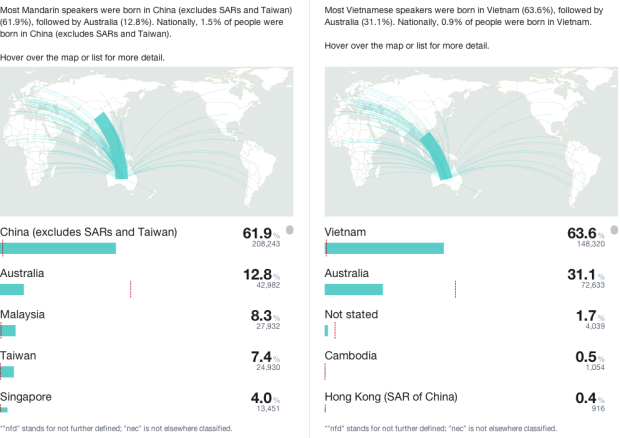
Last week, Australia released data for their 2011 Census. Small Multiples, in collaboration with Special Broadcasting Service, put the data to use and built an interactive that compares demographics based on primary language or location. Choose a language from the dropdown menu on both the left and right, and your selections are presented side-by-side. The graphics themselves are fairly straightforward, showing estimates of things like gender and household income, but the key is in the comparison, which provides a sense of scale to what would otherwise be a bunch of percentages.
Side-by-side comparisons for Australian Census


The language used in the relative earnings comparison is extremely poor. “Most male English speakers (11.5%) earned $2,000 or more weekly” This is patently untrue. In fact the inverse is true. Most male English speakers (88.5%) earned less than $2,000 weekly…
Thanks for the feedback, Gary; you’re right, it sounds really off. The reason why it reads like that is because we looked for the bracket with the highest percentage (“$2,000 or more weekly” in this case) and formed the sentence that way (and there were many sentences and rules…).
So I guess it should be something more like “The income bracket with the highest percentage of male English speakers (11.5%) is $2,000 or more weekly.”