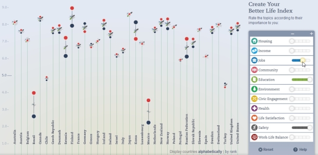
The OECD’s Better Life Index which debuted last year to much fanfare has been updated with some great new features by Moritz Stefaner.
The concept and beauty of the original piece remain intact. However, the experience is made better by the ability to compare to different demographics. For instance, after I adjust my Better Life settings, I can see how my settings compare to other women my age in the US, or to French men. It’s fun to compare to different people around the world and watch the flowers readjust themselves to the various comparisons. It invokes a sense of global community and humanity.

It also has better sharing. It offers the usual suspects, plus you can embed your index on your site. Equality between men and women is always a big issue, so that’s addressed in the new version as well. You can select to see the split, and it also shows both gender and social inequality per indicator when you drill down to the specific country level.
This is an excellent update to an already great tool. I’m glad the OECD sees the value and continues to invest in it.
[via @jcukier]


Fantastic.
It was a great piece when it came out, it’s great now.
I am somewhat unclear what the men/women ranking on the main page actually represents.
It would also be nice to see things like religious tolerance, LGBT issues, and other related issues covered in the future.
down?
It was indeed down, but the site is up and running now.
I agree the visualization is pretty and the interaction is user-friendly, but I find it quite hard to read. The “flowers” make it difficult to compare the heights…