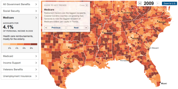
I missed this one a while back, but The New York Times had a look at the growth of government benefit programs, such as Medicare, Medicaid and Social Security, in the United States. On the surface, it looks like your standard choropleth map that shows percent of income from government benefits, but there’s a lot going on here that makes the piece really good.
First, the arrows on the top right let you browse through decades, going back to 1969. Roll over counties to see a time series for the corresponding region against the national average. The sidebar on the left lets you view breakdowns for different programs. And finally, the guide to key trends provides a narrative for noteworthy regions and patterns.
Now that’s some good data journalism.
[New York Times | Thanks, Jordan]


You call that good data journalism?
Putting Medicare and Social Security in the same bin as Medicaid? In case you’ve never paid attention, you pay premiums, just like any other insurance policy, for Medicare out of your paycheck every week. You are forced to pay into the Social-Security fund through automatic deductions as well. These are not welfare as is Medicaid, so only a “journalist” from the NYT would be biased enough to try and lump them all together.
You can look at them independently in the graph. Benefits (vs Welfare) depends upon your definition of the word. I have benefits at work (health insurance, 401K, etc.) that I pay premiums on.
Doug,
In the article (there’s a link to the “Related Article” on the map. Find it here: http://www.nytimes.com/2012/02/12/us/even-critics-of-safety-net-increasingly-depend-on-it.html)
the NYT writer says,
“Yet this year, as in each of the past three years, Mr. Gulbranson, 57, is counting on a payment of several thousand dollars from the federal government, a subsidy for working families called the earned-income tax credit. He has signed up his three school-age children to eat free breakfast and lunch at federal expense. And Medicare paid for his mother, 88, to have hip surgery twice.”
So the writer is clearly lumping Medicare, an insurance policy that has premiums forcibly deducted from your paycheck, with EITC and free lunch programs, which are benefit programs.
Also, the part of your insurance, 401K, etc. from work that you pay for are not part of your benefits…the parts your employer pays for are the benefits.
Correlation between benefits and bible belt appears high.
http://en.wikipedia.org/wiki/File:BibleBelt.png
Would have been nice if they had included agricultural subsidies and price support, especially given that they have a category labeled “All Government Benefits”.
Lets relieve them of their hypocrisy: cut all federal funds to tea party/republican states. Or throw them out if the Union. I don’t want my taxes paying for anything to do with those who bitch about federal assistance, until they need it.
I have to agree with “Jack H.” and “David” that the data’s neither representative nor complete. The Times has fallen into the whiz-bang graphics/chart junk trap by not critically examining the data sources on this one.
BIG DATA’s got value; however, I’d rather have ‘Right Data’.
Cheers.
Those are the big ones obviously, how far do you go? You could put military base spenditures on there for example.
I’d really like to see the ration of taxes paid to government money coming back by state or county. That would be telling.
Pingback: Geography of government benefits | Celframe ® Blogs