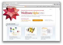
 Taking the next step in the Wolfram|Alpha experiment, Wolfram launches a Pro version that lets you plug in your own data and get information out of it.
The key idea is automation. The concept in Wolfram|Alpha Pro is that I should just be able to take my data in whatever raw form it arrives, and throw it into Wolfram|Alpha Pro. And then Wolfram|Alpha Pro should automatically do a whole bunch of analysis, and then give me a well-organized report about my data. And if my data isn’t too large, this should all happen in a few seconds.
I haven’t had a chance to try it yet, but the sense I get from others is that the part about data not being too large is key. Apparently it’s still in the early stages and can’t handle much data at once. The main hook is automated summaries, model fitting, and some graphs, but if you know enough to interpret the models appropriately, shouldn’t you know enough to derive them?
I’d love to hear initial thoughts from those who have tried it. For those who haven’t, it’s $4.99 per month, but there’s a two-week free trail.
[Wolfram]


Interesting. I wonder who the target audience for this is – people with complex data sets to analyse who aren’t analysts themselves and who can make use of an automated analysis?
The best I can think of is non-analyst data collectors checking their data makes sense during the course of their work before passing it to an analyst or reluctantly doing serious analysis themselves. For example, I could imagine a scientist using something like this to eyeball the results of a study as they come in to make sure the results make basic sense and don’t indicate a methodological fault that means they should abort and start again.
For me the worry is that the target audience is the ‘busy executive’ who might then blindly trust and make important decisions based on a machine-generated report which might have missed a fundamental nuance of the data.
I agree! A ‘busy executive’ doesn’t have time to muck around with the data and select the relevant columns nor select a representative sample of the data. Hopefully the busy exec has a data analyst who will perform the required work.
So far not too useful since you can’t upload databases. Also, the file size limit on upload is 1MB.
I have tried out the free trial period. It seems that it is just a number of examples that you can try out. At least I have not succeeded in uploading some of my data to compare what Alpha can find with what I have found already… So far the examples are straight forward.
I generally believe this is a fruitful direction to go in. However, after playing a bit with the new Wolfram|Alpha Pro version, I go back and forth between feeling amazement about some new capabilities and frustration about the lack of true understanding and steep drop off in usefulness once you go just a bit beyond the carefully curated data sets.
I tried uploading and visualizing some data I had logged from a personal long distance cycling adventure trip. It just didn’t recognize a data point like 65°30’39” and 148°35’50” as the latitude and longitude of some place in Alaska – and short of my re-formatting the data I have no way of telling it to learn what this data means. I tried “Panamerican Highway”, but to no avail. I tried “longest road”, hoping for some tidbits, but instead got “US20” as the result (longest highway in the US at 3237 miles). So one the one hand you can learn some interesting tidbits about which states, cities, bridges and how much traffic you will encounter on US highways. But on the other hand if you bring your own data, especially outside of the US, you’re likely beyond the curated data sets and hence out of luck.
Next I tried some simple, fictitious company financial data from an Excel spreadsheet. When I pasted about 1200 rows, it just said said that it couldn’t interpret the data. When I pasted the first 10 rows it did just fine. (So more robustness in dealing with nulls, separator chars, or other data quality errors will be needed.) It went ahead and threw the kitchen sink at me: Scatter pot, bar chart, bivariate histogram, pie chart, area chart, other histograms … you name it. While some of it looked reasonably useful, I wonder how much new insight can come form such shotgun-style automation. Also it displayed covariance metrics and eigenvector analysis. You can’t help but feel that to a (scientific computing) hammer, every problem looks like a (scientific analysis) nail.
I think a more sophisticated understanding of data, metadata, context and typical uses of data will greatly benefit such automated analysis and visualization attempts. Other commercial tools also achieve a lot of their functionality and usability from a better understanding of data types and typical visualizations (see Tableau’s “Show-Me” functionality).
At present this is more of an experiment in automation than a serious complement to, much less replacement of analysis of BI tools. But since Wolfram will collect tons of data, queries, and visualizations it can rapidly improve the capabilities. This will be something to watch in the months and years ahead.
try Splunk, http://www.splunk.com, it’ll eat anything big or small.