With the new year, many of you (myself included) and your employers resolved to be more productive this year. You are going to finish that side project. Learn that new language. Run that long distance. You are going to be all that you can be. Then you spent all day in front of the television yesterday while playing Angry Birds. Little did you know, productivity and Angry Birds go hand-in-hand.
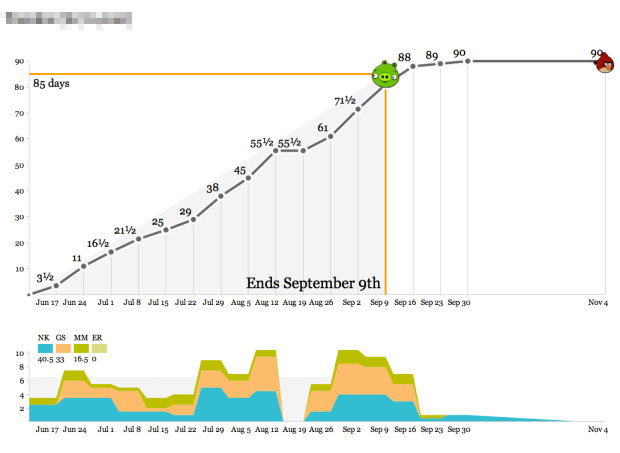
Enter Productivity Birds, created and used internally by Stamen.
We’ve used these graphs as the simplest-possible visualization of how we spend our time so we know how we’re doing relative to the budget for a project. Operationally, the data output of these graphs feeds directly into an accrued revenue model that lets us predict our income earlier. The day/week granularity makes it possible to collect the data as a team without making everyone unhappy with management overhead, and the bias toward whole- or half-day increments helps stabilize fractured schedules (not for me, though—my time is probably the most shattered of anyone in the studio).
Calendar time is represented on the horizontal axis and time spent on a project is the vertical. The object of the game is to hit the bird, where a bird over the pig means a risk of losing money, and a bird past the big means a risk of finishing late. The stacked area chart on the bottom shows who has been or is working on the project.
The small app, built with Protovis, is available on GitHub.


Hours worked has no meaningful relation to productivity, graphs need completed work vs. sched, or completed work vs cost.
>flowingdata @BurntSynapse True, but I think it works for a small group. And bc these are programming projects, it’s hard to judge % complete.
@flowingdata Whoever challenges the awesome power of modern schedule-fu is invited to have their WBS’s kicked w/ serious PMBOK Ch. 6 skill! Actually, such difficulties indicate poor project management. Specific module functionality, testing, module integration, testing, bug stomping, etc. are all properly scheduled in advance, and completion progress can be tracked without exorbitant costs.
Hi,
I like your application. You need to ad options for destruction since that is an important part of the game. If you don’t perform efficiently and plan, the game ends and your company goes down the tubes.
Thanks,
Jim
Buck—you’re right, but productivity is not what we’re counting here. We’re trying to track profitability, which has a strong relationship to time and money. The productivity boost comes “outside” the graph, in the sense that we can tell whether we’re spinning our wheels and understand the turning points in a project by looking at a full wall’s worth of these graphs.
@Michal,
I’m going to come right back at you by pointing out that hours used vs. scheduled has as much correlation to profitability as it does to productivity (little to none), unless your firm bills hourly and the app model uses ABC (activity based costing).
“Spinning our wheels” suggests productivity. I cannot stress enough how widespread are the misconceptions about this among business managers.
The gold standard metric absolutely MUST be work complete. Against that, the organization can measure schedule performance and cost/budget performance (and check how well planning is doing). DO NOT measure cost against schedule because spending money over time WILL NOT tell you whether you’re spinning your wheels… well, actually to use your analogy:
We want to drive to our goal of point B from point A. We know the distance to travel (work to be done). We know that a certain speed of spinning tires (cost) will get us there in 10 hours, assuming no slippage. Measuring spin (costs) over time does not tell us how we are doing since some slipping is expected. Only the mile markers are reliable metrics to judge cost, etc. Having a wall full of unreliable metrics does not transform them into reliable sources, unless you have some magic I’m missing.
If so, please share!
The magic, Buck, is that these graphs are one small part of a larger system. The need they addressed was making utilization visible in the group. Everything else lives elsewhere.
@Michal
OK – “utilization” can be tracked this way, but stakeholders should all be clear to distinguish this from productivity, profitability, and “wheel spinning” efficiency, using the right terminology to avoid errors that are so common, you wouldn’t believe…