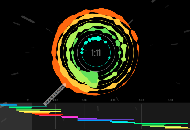
Mashups, the art of mixing multiple songs into one continuous song, is a subtle art. When a mashup is done well, you often can’t hear all of the different songs merging into one, because it’s so fluid. Cameron Adams, aka The Man in Blue, visualizes his own mashup Definitive Daft Punk, to show just what goes into the piece.
You might have seen the similar work from Benjamin Brahn, who showed Girl Talk’s mashup album All Day, which sampled from 373 songs. While Adams’ mashup is not as massive, the visual component is quite nice. Each circle represents a sample from a song, and going clockwise from the top, you see middle, high, and bass. Then on the bottom is the breakdown by time.
It’s all done in HTML5 and CSS3, so you’ll need a modern browser to see it in action.
[Anatomy of a Mashup | Thanks, Cameron]


Hi
I’m working on a Business Intelligence tool in South Africa (I work for an NGO so its open-source :P). Any chance we could get access to the source code?
Awesome visualization by the way!
I was just wondering, from a layman’s perspective, how is this different to what a DJ worth his/her salt does with two turntables or more?
@Greg, do you have a URL for your BI project?
@Ken – drop me a mail at greg.rowles @ gmail dot com? Its sitting behind a firewall with a security. If you really want I can set up an account for you to view it…