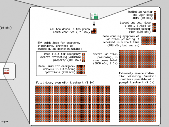
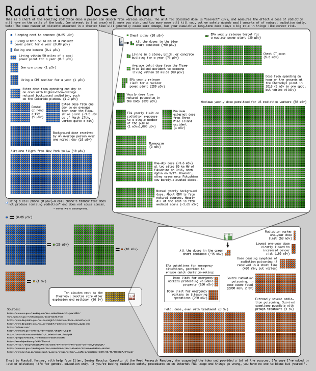
Randall Munroe of xkcd, with the help of a friend who is senior reactor operator, puts radiation dose in perspective:
I’m not an expert in radiation and I’m sure I’ve got a lot of mistakes in here, but there’s so much wild misinformation out there that I figured a broad comparison of different types of dosages might be good anyway. I don’t include too much about the Fukushima reactor because the situation seems to be changing by the hour, but I hope the chart provides some helpful context.
Start at the top left (sleeping next someone), to the right, and then down (standing next to the Chernobyl reactor core after explosion and meltdown) for increasing levels of radiation and warnings.

Really informative. See full version here.
[xkcd | Thanks, @augustjoki]


Pingback: Radiation Dose Chart | The Big Picture
I don’t think that such chart makes comparisons easier. I would prefer a simple logarithmic version of the chart on National Post http://news.nationalpost.com/2011/03/15/graphic-how-much-radiation-is-being-released-by-japans-runaway-reactors/
(here in Italian version http://www.antoniorinaldi.it/radiazioni/)
ever hear of Excel?
Clear presentation. Good work
Pingback: Understanding radiation dose levels | Coldstreams.com by Edward Mitchell
Pingback: XKCD Radiation Dose Chart « The Markr
A serious work provides its sources. Just saying my info comes from a buddy expert is not enough.
Giving the sources is really necessary here because people have to understand differences in the levels published.
You have to distinguish the health effects of (absolute) dose from dose rate. You can “better” stand the same dose from a long exposition but at low dose rate than the same amount received in a short time span.
There is a difference between the same amont of nuclear radiation incorporated (digested, inhaled) and received as radiation (such as the workers when wearing protection gear do).
Also, there is no single lethal dosis.
There is a lethal dosis for 1% of the population which is if I remember well 1sv.
8sv given in the infographic is the lethal dosis for 100%.
@Frank – I agree, and he includes a list of all of his sources in the bottom left.
Right, I change my spectacles to better read the small print
Pingback: Make the Jump: Organize, Purge & Visualize | Red Sky Public Relations
Pingback: The Radiation Dose Chart [Infographic] - Toastup!
Pingback: Radiation Dose Chart | Jackpot Investor