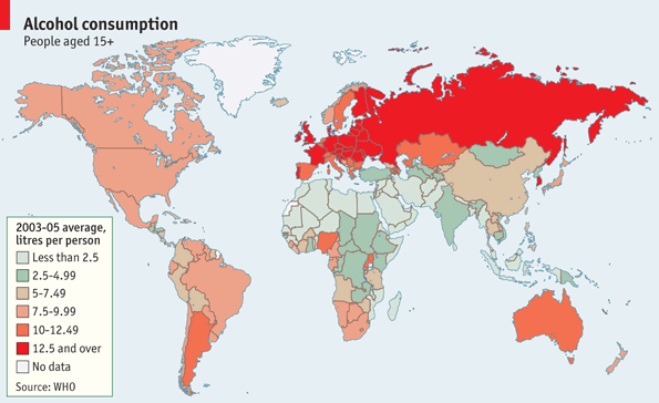
What and how much people drink depends a lot on what country you’re in or what culture you’re exposed to. Personally I grew up in a low-alcohol family. It’s not that we thought it was bad, but just because, well, it didn’t really occur to us to do that. The Economist shows these differences via this world map on average alcohol consumption, according to a recently released report by the World Health Organisation.
The world drank an average of 6.1 liters per person in 2005, but it was significantly more in Europe and the Soviet states. Hey, you gotta stay warm somehow, right?
Have a look at this map for legal drinking age. Is there any relationship? Doesn’t seem to be a very strong case.
[Economist | Thanks, Elise]


What type of alcohol or rather what percentage was it?
According to the WHO report:
“[T]otal adult consumption, unrecorded consumption, consumption in different World Bank income groups, and most consumed beverages in terms of litres of pure alcohol are examined and presented. The principal measure is adult per capita alcohol consumption (APC) in litres of pure alcohol.”
A few questions if I may:
Is it the amount of pure alcohol per year? How much pure alcohol is in a liter of beer/wine? And what is the amount as of which it becomes a health thread?
Besides this, nice map – clearly Europe is collectively drunk most of the time :)
Dear lord, that’s a trainwreck of a color sequence. I notice that an Econtomist “Daily Chart” entry from just a couple weeks back uses the same colors but sequences them much more logically.
I think it might correlate more to a map of predominant religions than to a map of drinking ages… got one to compare?
I’d like to see this mashed-up with the “life expectancy” data from your previous post. Correlation proves causation, right?
Intresting map. What I would like to see is the absolute numbers too. How much over 12.5 l the high countries consume? How much do the low countries actually consume? To what do the numbers compare – are there some medical conditions etc. the numbers correlate to?
Setting the limits of high and low can be used to tell different stories (Europe drinks a lot, world drinks enormously, Russia drinks a lot)
I think Wisconsin should be counted as a separate nation. It might place the rest of the US in a lower consumption range.
It sort of is:
https://flowingdata.com/2010/03/02/where-bars-trump-grocery-stores/
Soviet states? I am sure they disappeared 20 years ago. You might hurt some feelings with such a mistake :)
I bet you’d see a correlation if you could also account for per-capita disposable income relative to cost of alcohol.
Nice. Just like to drop chartsbin.com like here http://chartsbin.com/graph/drugs_and_crime?sortby=chart_modified_date&search_q=alcohol which contain more alcohol maps.
List of maps:
Most Consumed Alcoholic Beverage by Country
Current Worldwide Alcohol Consumption Among Adults
Worldwide Lifetime Alcohol Abstention
Worldwide Alcohol Drinking Patterns
Five Year Change in Alcohol Use
Speaking of the gross alcohol consumption , Chinese definitely drink the most…