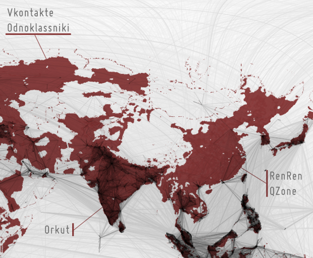
While it was fun looking at the worldwide connections on Facebook, I thought it was more interesting to look at the places where there were very few connections, where it looked pretty dark on Paul Butler’s map. Some commented that was just a product of no people in those areas. Where there’s no people, there’s obviously no Facebook. This is true in many areas, but not all them.
Thorsten Gaetz adds some context, by mapping areas in the world where there are more than two people per square mile (colored red). Then he overlaid a grayscaled version of the original network connections. What you get is a view of where social networks other than Facebook like Orkut and RenRen lead the market.
[Flickr via @moritz_stefaner]


Pingback: Jillian C. York » Facebook Use: Access, Filtering, and Languages
“What you get is a view of where social networks other than Facebook like Orkut and RenRen lead the market.”
That strikes me as a rather naïve statement. I could believe it for China and a few other places.
Perhaps Hi5 is the dominate social network in West Africa, as the label shows. But the real reason it’s dark is because only 7 in 100 people in Nigeria, for example, have access to the Internet period.
Right. Isn’t that what I said in the beginning?
You did say “This is true in many areas, but not all them,” but I’m saying that Orkut and RenRen don’t lead the market in (most of the) brown area sans FB connections, *nothing* does. It’s just a bunch of people without the Web.
Anywho, not to nit-pick. Still a cool image.
this could be a good complement to this: http://www.vincos.it/world-map-of-social-networks/
Pingback: Perspectives – Intelligible Ideas
I would like to see the Facebook map refined to show communities, like this recent study: http://halfblog.net/redrawing-the-map-of-great-britain-from-a-net
I imagine it would simply show language relationships, but it would be interesting nonetheless.
It seems that the map shown here has a different data set than the one in Flickr, why?
I overlayed them for demonstration, turquoise are in both, red is missing from Flickr image: http://misc.oranse.net/facebook_map_difference.jpg
I wonder if population density is the right context for the map. I just launched my new blog with a post about a comparison with urbanization over at http://lookingatdata.blogspot.com/2010/12/facebook-friendships-and-urbanization.html
We can’t access Facebook and Twitter in Chinese mainland because of GFW
Pingback: Facebook, le beau et le moins beau | Karizmatic
Pingback: The World According to Facebook – Dead SULs
Pingback: Perspectives | HG Communications